POS
Production
Strategy
Communication
Branding
Most sports brands talk about sweat, blood, and victory. With Sport Vision, we bet on the courage to start in the first place. Our role is to transform the brand from an equipment retailer into a curator of urban style.
Part of this solution, therefore, includes a visual identity refresh, which was inconsistent and lacked distinctive elements. The brand functioned mainly through physical availability, but it lacked a face that would be recognizable at first glance in both digital and physical spaces. Our only limit was keeping the logo and colors.

Proof of work
1
a flexible visual identity that meets the brand's contemporary requirements.
85
pages of brand guidelines with defined principles and rules for using the new identity.
7
unique brand assets: logo, colors, font, icons, illustrations, photo, grid.

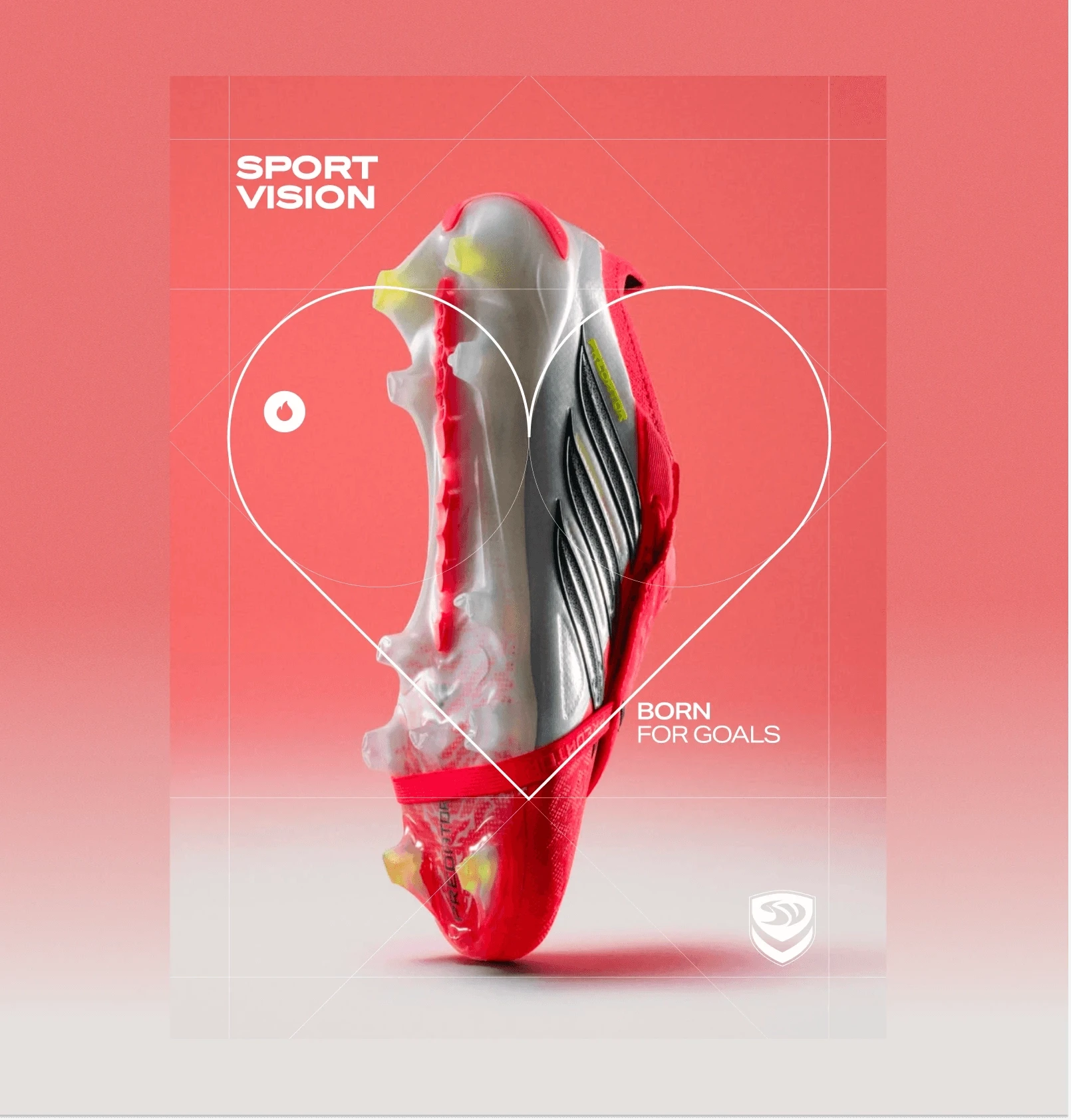

Flexible grid system
The designed flexible visual style of Sport Vision works with ellipses, axes, grids, and targeting elements as a metaphor for what the brand does – helping to focus on the vision and find direction. The axes are the coordinates of your start, the grid is the space in which you move.
The distinctive typography and new font build on the morphology of the logo and make the brand easier to read and recognize. Digital UI elements inspired by sports apps and the online environment move the visual away from classic retail into the language our community lives every day.


Account Manager
Creative Director
Art Director
Graphic Designer
Strategy
Jan Štička
Iva Janigová
Daria Kriuchek
Kate Balajková
Martin Dráb
Kate Balajková

 Download our presentation